Cabs vs Uber
Since the introduction of the iPhone, our lives and habits have changed dramatically, and one of these big changes involves the way we travel around cities. For example, 10 years ago we used to raise our arm to call a cab, nowadays we most likely go for our phones, and probably in some years we’ll summon a driverless car using our watch. Moreover, all these changes are also affecting companies that haven’t been able to evolve (think about Nokia) and entire compartments of the economy (sorry drivers…).
In this post I will take a look at the traditional cab companies operating in NYC and see how they are doing in the era of Uber. Are they doing well or just dying slowly? To answer these kinds of questions I used the data of the The New York City Taxi & Limousine Commission (TLC) which has made publicly available a gigantic database of all the rides of the Yellow Cabs, Green Cabs and FHV (For Hire Vehicle) companies in NYC from 2009 to present.
This database can obviously answer a bunch of interesting questions and should be exploited much more than what I will be showing here. To mention some possible direction:
- When and Where should vehicles stay to maximize total income?
- How bad is rush hour?
- Is it better to take a cab or a city bike or the metro?
- Are you tipping too few?
- …
Data
The TLC provides a monthly dataset for each of the three categories of vehicles operating in NYC (Yellow, Green and FHV). The average monthly dataset contains around 10^8 rides and weights around 1 GB. In total (from 2009 to present), there have been roughly a billion rides (yes, a billion!) for a total of 250 GB. In fact it is so big that it does not fit on my laptop.
Fortunately a large part of it can be already found on BigQuery, and can be assessed via simple SQL queries. The 2017 data is not there, so I downloaded them directly from TLC. Take a look at my GitHub repository for an explanation on how to retrieve the data and play with the the notebook.
The FHV dataset contains the rides of all for hire vehicles, among which Uber’s. The latter can be identified by the license ID (also provided by TLC). However, at the moment, this data is not as exhaustive as the one of the Yellow and Green cabs, as it often contains only the license ID and the pickup time. It is however sufficient to individuate the amount of trips made by Uber cars. Notice also there is an error in how BigQuery retrieves the FHV data in June 2015, which I’ve fixed by looking at the original TLC data.
Bye Bye cabs…
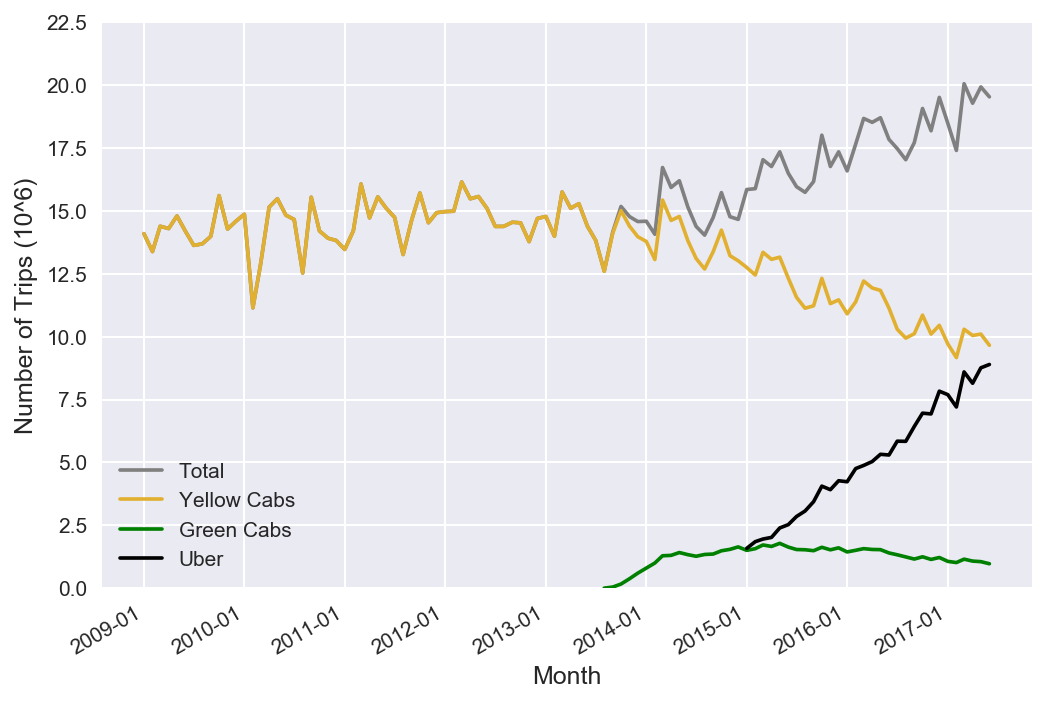
The main point of this post is summarized in the next figure, where I plot the amount of trips made by each company per month. I think there are three main take-home messages:
- Uber is overtaking the Yellow Cab company (which lost 30% of its customers in the last 3 years).
- Uber has changed our habits as people are more likely to take a ride.
- At this pace, the traditional companies will be closing business in 3 years.
One may think that with the falling number of rides and additional competition the prices of the Yellow and Green cabs would fall. However this does not seem to be the case. In fact looking at the average trip cost in the next plot, it seems that prices have been pretty constant in the past years. (Unfortunately no data from Uber.)
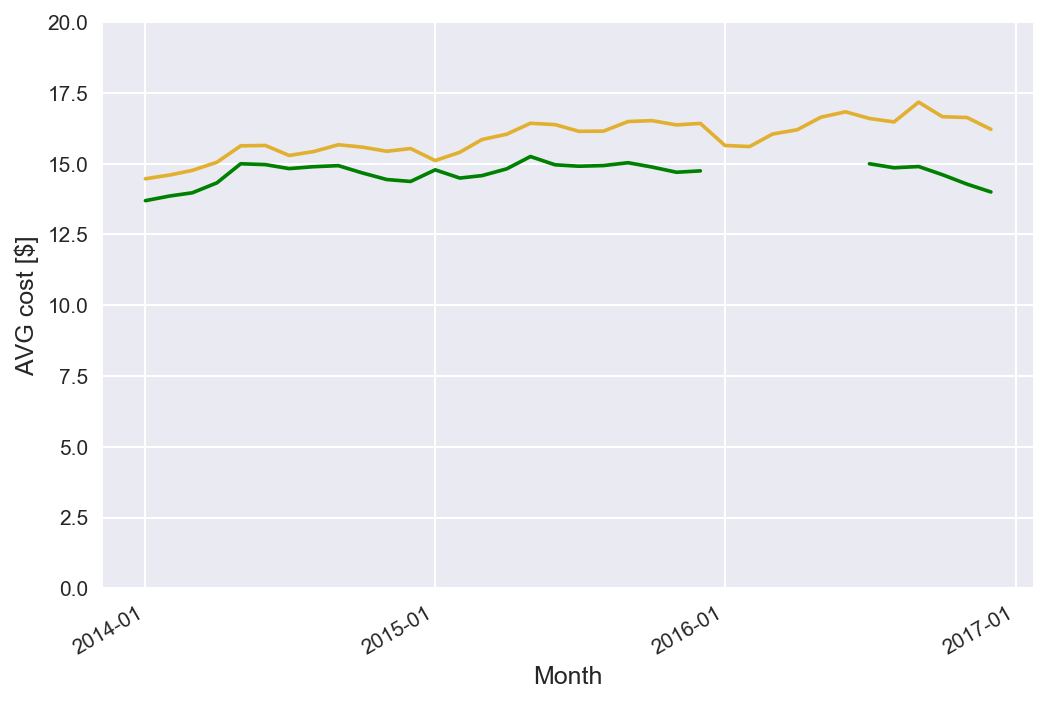
Notice however that this plot shows just the average cost of a trip, and one should not think that the Green cabs are cheaper, as the kind of trips the take might by different (therefore biasing the cost).
GitHub Repo
The data for these plots are available on the GitHub repository if you are interested in doing your own analysis.